This time I used the Tombow pens plus some watercolor paints for the glazes. Highlights are the Sharpie white paint pen marks. Extra fine point. Heartily recommend it.

This time I used the Tombow pens plus some watercolor paints for the glazes. Highlights are the Sharpie white paint pen marks. Extra fine point. Heartily recommend it.
Tombow brush pens were used for todays breakfast sketch. Three colors. Violet, blue, and a dark green. The pens have numbers rather than names of colors. Ive hardly ever used these pens but am now encouraged to give them a test run. I bought the Landscape palette set. They are waterbased and blendable with two tips. Brush on one end and fine point on the other end.

Ive painted this scene before and wanted to another one. I planned to change the color palette but somehow ended up with similar. Tomorrow will try again.

I was cutting up larger sheets of watercolor paper for my beakfast sketches. I did not notice a few drawings on the backs - this was part of a large landscape that I never painted so I thought I'd paint it today. Blue skies and clouds are refreshing.

Ref. Matisse painting. 1912-13. this was a sweet challenge. Soft colors and indistinct shapes. A lot of it didnt make sense to me and i didnt have a good grasp on what he was doing - BUT I still had some fun with it. I had blocked out the whites with a birthday candle before starting. That created its additional challenges. Overall ok.

This is another Matisse painting which is roughly sketchd on watercolor paper. It is what I want to do tomorrow morning. I love the soft feminine palette.

Breakfast was lare today. Time for two paintings. Lesson learned. Dont make mush in a crock pot. Takes forever.

This is a palette that I seldom use. When I saw this ad i was inspired to play with the colors.
Breakfast quick study. Aug 25

On her blog she shows more of her work and describes her processes. You can see more at rcscreations.com/2015/05/14
Ive had this one leaning against here and there in living room all this time. Its a great favorite of mine so I wanted to share it with you.

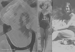
Nik is so patient. She can hold a pose as long as she is comfortable. I like the simplicity.

A couple years ago when i was in the portrait mode - I had transferred this sketch onto watercolor paoer. I dug it out of a "starter" pile of sketches that might someday call out to be painted.
Ĺ I started it yesterday with very dark hair and moutache. Then I added a background resembling oil painting strokes w palette knife. It was not working so using a wet brush I lifted the dark colors and tweaked many adjustments.
Next I used a soppy wet brush and scrubbed the colors in background to muddy it to a neutral then dabbed with textured paper towel. It really softened the whole atmosphere. I can see a few things I want to tweak more. But I think for the most part it is done. During this transition he appears younger and younger. That was not my intention.
I want to do it again and make him more weathered and worn. The way cowboys look after years in the saddle breathing dust and baking in the hot sun.

This painting is a work in progress. I dab a bit on it niw and then. Today I added some collage papers and some gold paste. One of these days when Im dabbling I expect to be inspired and really go for it. I love having it sitting on the easel waiting. Since I really dont have an idea of what I want it to be - i trust it will evolve at some point. Or not. Lol

This is as much a study in color mixing as a subect oriented work. im not finishrd w details but ready to set it down until later in the day.

This is how bowl is formed. Lots of examples on you tube. Or if you are lucky you have a friend who can demonstrate.

Busy work. These coiled bowls are a lot of fun. The cording is wrapped with strips of torn sheets. Recycling. I got the full size sheet at flea market for 50 cents. I loved the colors and knew it would look fresh and a bit beachy. Just what i want on dining room table.

The orange roof on his painting Thatched Cottages is so intetesting I did a closer up
Sketch. Where i live the colors of homes are all neutrals and muted. Its frowned upon to use bright colors. blue houses and orange roofs are so much more pixturesque. don't you think?

The reference for the poppies is a card produce d and distributed by Robert Frederick Ltd. I might go back and add more details but this am looseness was the goal.

I was always cleaning up the lids of my watercolor boxes. Seems like a tidy way to do things. Start fresh every day. Just wipe with damp paper towel. Done.
BUT- I observed friends who are better water color painters were leaving their mixing trays messy. hmmm... whats that about. I started to leave mine messy and discovered many interesting neutrals can be mixed with the dried colors. Mixing one neutral with another... what amazing colors. I think because they are more experienced they recognize those dried colors and the mixes. Perhaps they have a preferred palette and rely on certain colors.
Because I am using such a variety of references -i often try to match the palette to the ref.
I usually mix my colors on the paper wet into wet or by glazing over a dried color. Im working my way through this puzzle. I think i will try more of the tray mixing. Im agaist wasting good paint. I hated to toss those damp paper towels with the interesting colors after cleaning up. Lol.

Using orange paint and each blue color in paint box plus the purple - i wanted to see what the results would be. Quite a difference indeed. I didnt know what they would produce . I find this very exciting. Why did I wait so long to do this?

No more guess and by golly mixing. This is a color study from the Guitar paint box colors. Using the color wheel i started on the right side and added drop by drop of opposite color to see what they would make.

The lid of my paint box was so messy it seemed like the colors were beginng to look muddy. Thats a good time to play with mixing neutrals. Here are some.

Van Goghs thatched cottages inspired my breakfast painting today. Oh my what a challenge. This required a lot of color mixing. I can see I could do more to this. Hmm.....

This very dark toned post card of Longs Peak from Nymph Lake is my breakfast inspiration this am. The water was so still when the photo was taken it makes the reflection clear. I lightened the piece. I wanted to put in some clouds to soften it. Its going to be 100 degrees again today so doing a cool painting starts the day off with a bit of a chill. Ill add some ink lines later.

Todays breakfast sketch is from a post card I purchased in San Francisco. I liked it so much that every time I visit the City I buy another one. Lol. It was published by Marilyn Blaisdell 1973. You can probably find a source to order one online. I think it is charming. Printed on ivory it really does give it a vintage historical look.
You can see what painting on whie witjout an ivory bacground wash really changes the look. It was fun to use this image as inspiration.

Cezannes painting has always intrigued me. Not typical landscape colors. Here it is in watercolors.

Hows this for something different? This print is in a book of French Paintings. Redon 1840-1916 did this study in Tempura on canvas.
I thought it would be an interesting exercise to do it in transparent watercolors. its the only example of his work in the book. i think one day I will try to find more of his work.

This bush has been blooming like this since before Easter. Non stop. I deadhead it every two or three days. The other 27 rose bushes are not as prolific. We cut down 5 or 6 and will take out three more soon. This one has more than earned its right to stay. Right outside the back door in the dogs fenced garden - i get to admire it many times a day. And when I want to take roses to a friend it never fails me. I have a shelf full of bud vases and bouquet vases ready to fill and deliver.

His painting Church in Giverney is my inspiration this am. His impressionist style oil painting has a new look in watercolor sketch. All those little brush or palette knife strokes of many colors just cant be captured in this small format. But I like the composition. I had never heard of this artist before. Found a picture of this painting in American Art Review Dec 2004 p. 9.

I wont have time to paint tomorrow so I did two this am. Not a good idea to cook malt o meal in one room while painting in another. Smoke. Stench. Ruined pan. No big disaster. Opened windows turned on fans. 9 All ok.
I came right back and finished second sketch. The violet and oche one is based on something I saw on internet with cell phone. It was brilliantly done in oil. I dont know how to capture information on cell so I cant tell you whose work it is. It was more textural and abstract.

This little sketch is based on post card shown on left. The shapes behind were painted as part of an abstraction exercise. I drew them yesterday at mixed media meeting. This am I painted in white spaces. Not sure what I will do with them next.

Redmond (1871-1935) painted Poppies and Lupine. Seen in American Artist Review Dec. 2004. Another poppy landscape. Im always inspired by California poppies.

Lauritz's painting California Poppies is the inspiration for this sketch. photo found in American Art Review Dec 2004.

The simplicity and subtle colors that conveyed a sense of motion and freshness appealed to me. I left out the steamboat in my version and added a bit of red to the boats. Reminds of sailing days on the bay. But if I painted from memory it would have bridges and city scape in background. Hmmm... I might want to paint that. Or the Duck Boat in San Francisco.


